Obumbratta
Interactive Data Visualization
I design and build interactive visuals with data
Projects
Obumbratta
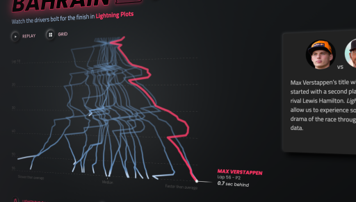
Thunder Roads
Analysis
|
Design
|
Code
|
1
of 8

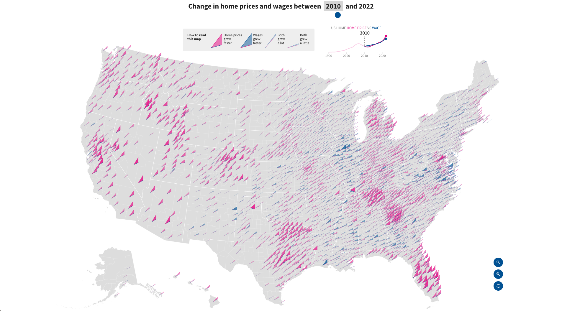
One of several tools and articles worked on with the USAFacts Data Projects team, this one examining the divergence between housing cost and wages across the US.
View Project
in collaboration with Voilà Information Design
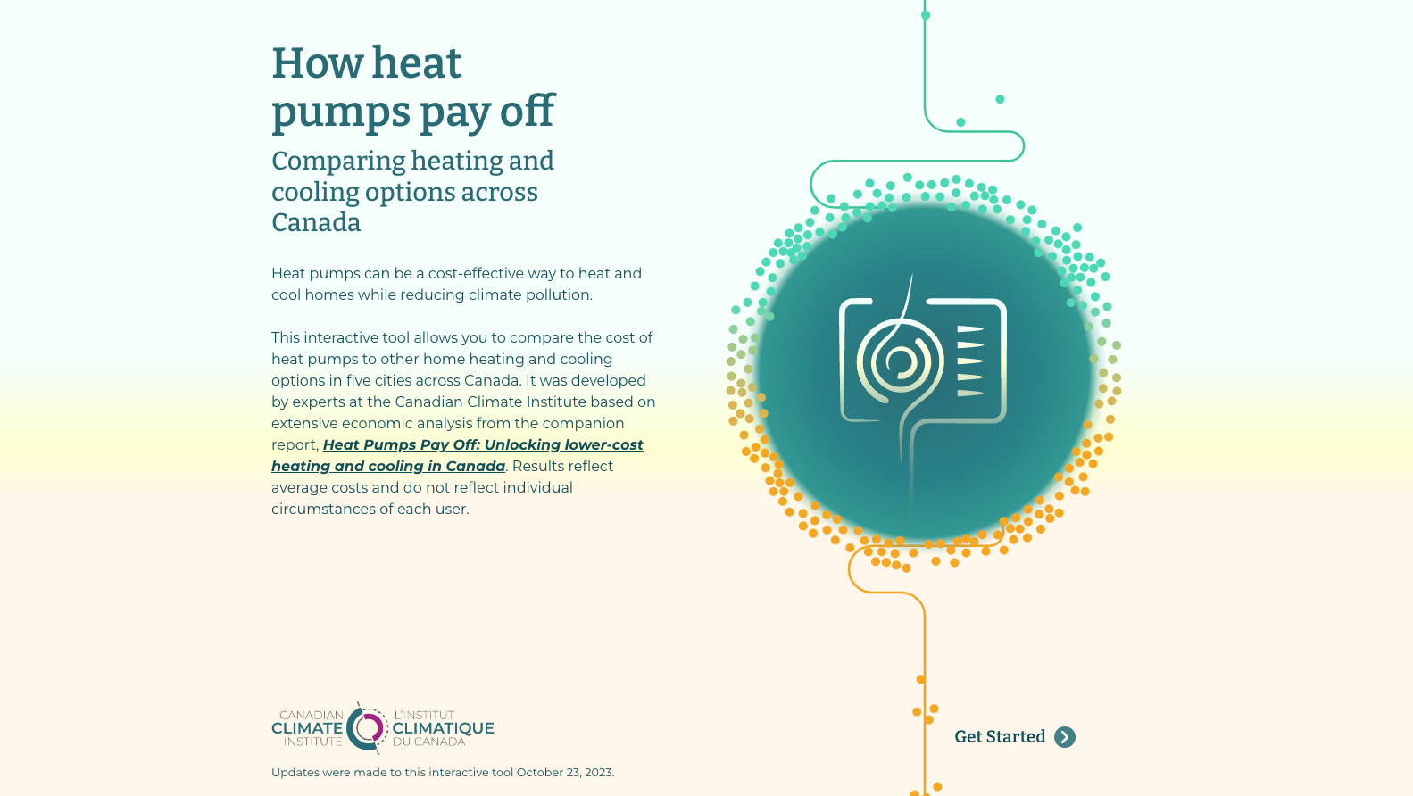
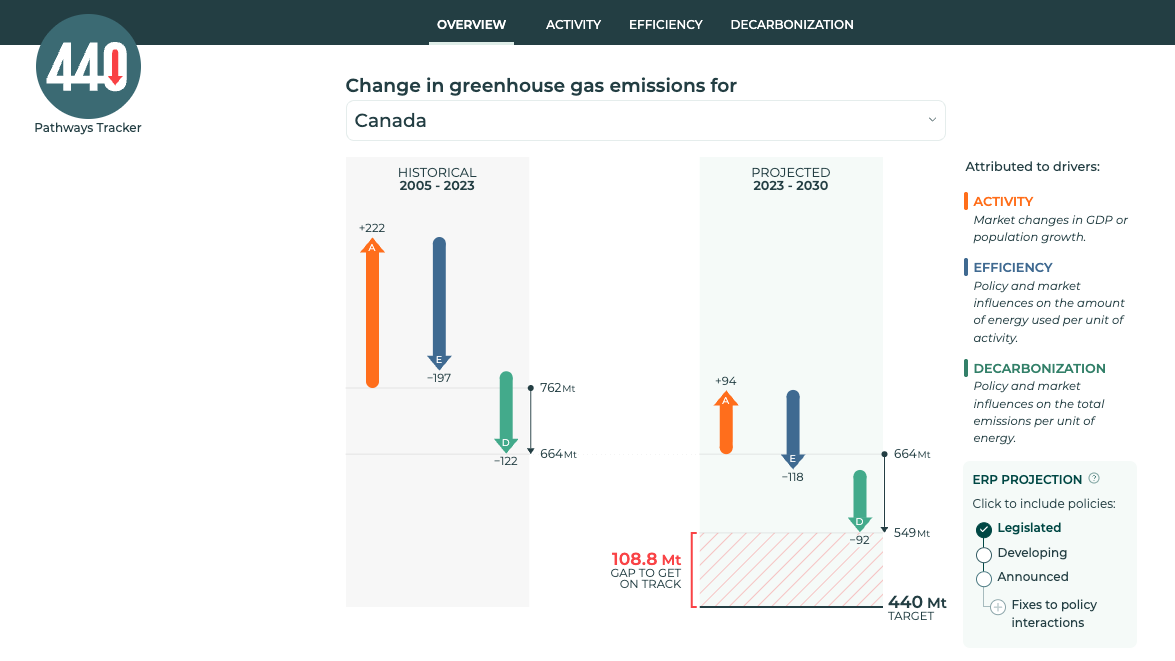
An interactive tool comparing the cost of heat pumps to other home heating and cooling options in cities across Canada.

View Project
with Darkhorse Analytics

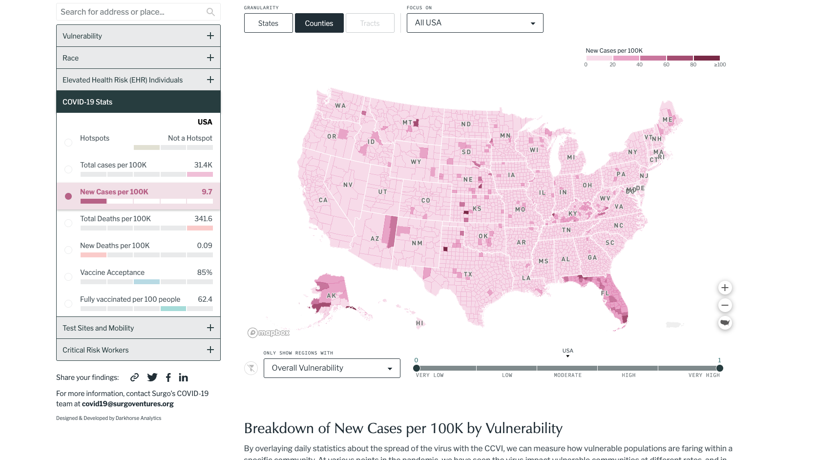
This interactive map plots millions of data points to facilitate creating solutions that help more children rise out of poverty.
View Project
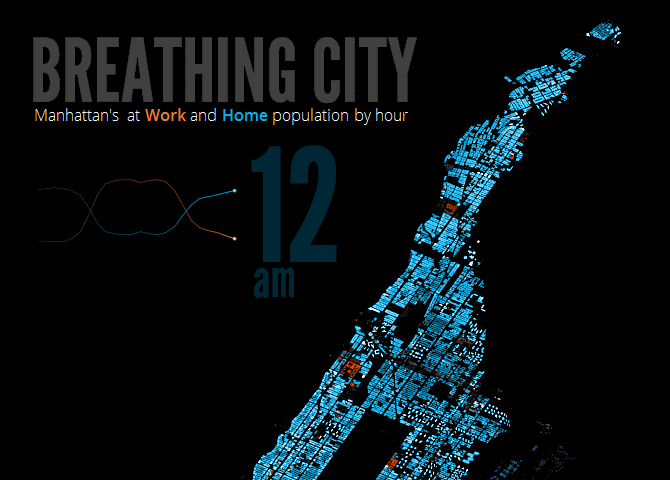
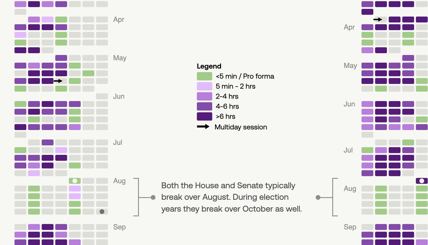
This animated visual simulates work and home populations in New York city on a typical day combining data sets from four different sources.

View Project
with Darkhorse Analytics
Economic indicators dashboard that allows viewers to see the impact of the pandemic and how the recovery is progressing.
View Project
with Darkhorse Analytics
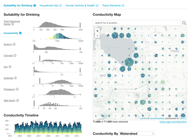
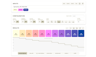
An exploratory dashboard for analysts to view well water testing results and investigate their correlations, distributions, and geographic patterns.
View Project
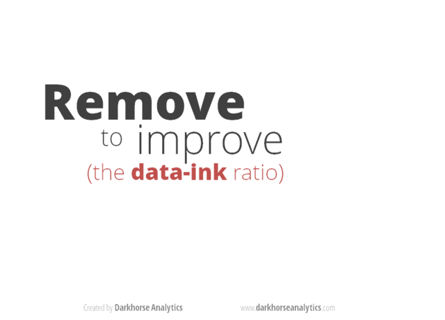
A series of animated visuals outlining guidelines for making your visuals more effective and attractive.
View Project
More Projects

with USAFacts
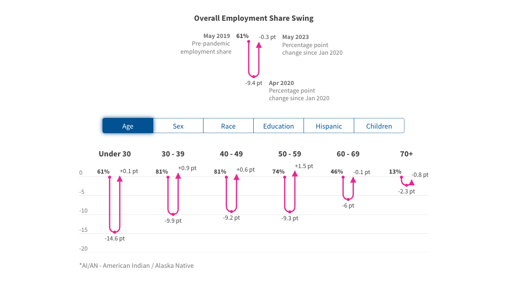
COVID Employment Swings
with USAFacts
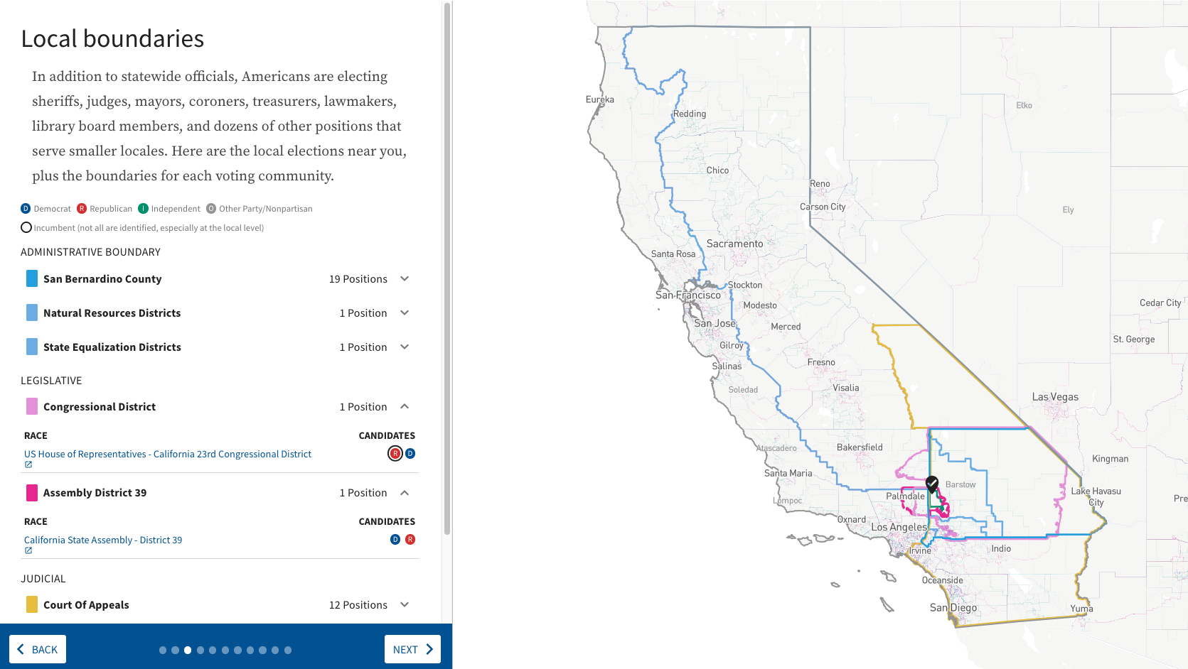
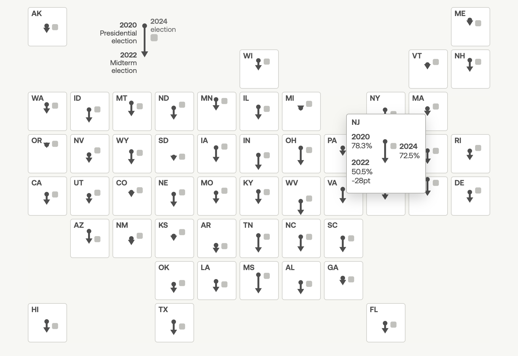
2022 US Midterm Map
Contact
I create clear and engaging visual tools. Get in touch if you'd like to collaborate.